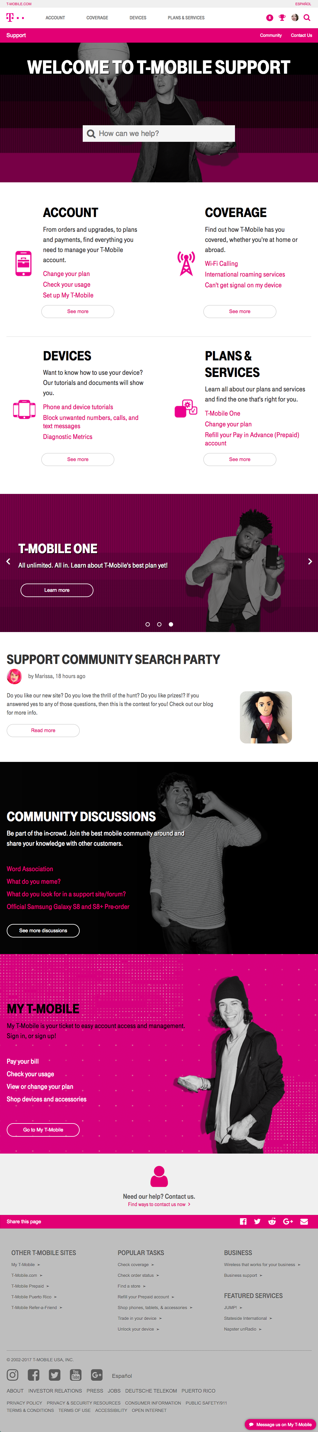
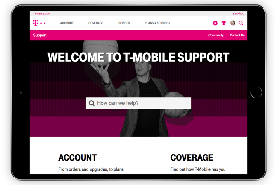
This cell phone company’s support website needed to be responsive so it can work better on various screen sizes. This meant it needed a complete overhaul.
Starting in October 2016 I began working on the T-Mobile Support website re-design project. The main goal of this re-design was to start from scratch with a new installation of the content management system in use then re-build the theme (design) to make it responsive so it adjusts to different screen sizes, then port over content from the old installation. As you can imagine this took quite a bit of time.
My job largely involved custom theme work on the content management system using the company design resource guide and design mockups from stakeholders. I kickstarted development on the new installation in a development server by creating a new theme. I created a custom front-end framework from scratch for our team which matched designs, then implemented it on this project. I also trained the team on how to use it plus provided documentation that I created myself.
HTML, CSS, JavaScript, jQuery, Freemarker, and Google Closure are the main programming languages involved.